
Tag Archives: Investments
Five charts on investing to keep in mind in rough times
By Robert Wright /May 19,2023/

Key points
- Successful investing can be really difficult in times like now with immense uncertainty around inflation, interest rates, issues in global banks and recession risks impacting the outlook for investment markets.
- This makes it all the more important to stay focused on the basic principles of successful investing.
- These five charts focus on critical aspects of investing that are insightful in times of market stress: the power of compound interest; don’t get blown off by cyclical swings; the roller coaster of investor emotion; the wall of worry; and market timing is hard.
Introduction
Every so often the degree of uncertainty around investment markets surges and that’s been the case for more than a year now reflecting the combination of high inflation, rapid interest rate hikes, the high and rising risk of recession which has been added to in the last few weeks by problems in US and European banks. And all of this has been against the background of increased geopolitical uncertainties. Falls in the value of share markets and other investments can be stressful as no one wants to see their wealth decline. And so when uncertainty is high a natural inclination is to retreat to perceived safety. As always, turmoil around investment markets is being met with much prognostication, some of which is enlightening but much is just noise. I will be the first to admit that my crystal ball is even hazier than normal in times like the present. As the US Economist, JK Galbraith once said “there are two types of economists – those that don’t know and those that don’t know they don’t know.” And this is certainly an environment where we need to be humble.
But while history does not repeat as each cycle is different, it does rhyme, in that each cycle has many common characteristics. So, while each cycle is different the basic principles of investing still apply. This note revisits once again five charts I find particularly useful in times of economic and investment market stress.
Chart #1 The power of compound interest
This is my favourite chart. It shows the value of $1 invested in various Australian assets in 1900 allowing for the reinvestment of dividends and interest along the way. That $1 would have grown to $246 if invested in cash, to $997 if invested in bonds and to $781,048 if invested in shares up until the end of February. While the average return since 1900 is only double that in shares relative to bonds, the huge difference between the two at the end owes to the impact of compounding or earning returns on top of returns. So, any interest or return earned in one period is added to the original investment so that it all earns a return in the next period, and so on. I only have Australian residential property data back to 1926 but out of interest it shows (on average) similar long term compounded returns to shares.

Key message: to grow our wealth, we must have exposure to growth assets like shares and property. While shares and property have had a rough ride over the last year as interest rates surged, history shows that both will likely do well over the long term.
Chart #2 Don’t get blown off by cyclical swings
The trouble is that shares can have lots of (often severe) setbacks along the way as is evident during the periods highlighted by the arrows on the previous chart. Even annual returns in the share market are highly volatile but longer term returns tend to be solid and relatively smooth, as can be seen in the next chart. Since 1900, for Australian shares roughly two years out of ten have had negative returns but there are no negative returns over rolling 20-year periods.

The higher returns that shares produce over time relative to cash and bonds is compensation for the periodic setbacks they have. But understanding that these periodic setbacks are just an inevitable part of investing is important in being able to stay the course and get the benefit of the higher long term returns shares and other growth assets provide over time.
Key message: short term, sometimes violent swings in share markets are a fact of life but the longer the time horizon, the greater the chance your investments will meet their goals. So, in investing, time is on your side and it’s best to invest for the long term when you can.
Chart #3 The roller coaster of investor emotion
It’s well known that the swings in investment markets are more than can be justified by moves in investment fundamentals alone – like profits, dividends, rents and interest rates. This is because investor emotion plays a huge part. This has been more than evident over the last year with all the swings in markets. The next chart shows the roller coaster that investor emotion traces through the course of an investment cycle. Once a cycle turns down in a bear market, euphoria gives way to anxiety, denial, capitulation and ultimately depression at which point the asset class is under loved and undervalued and everyone who is going to sell has – and it becomes vulnerable to good (or less bad) news. This is the point of maximum opportunity. Once the cycle turns up again, depression gives way to hope and optimism before eventually seeing euphoria again.

Key message: investor emotion plays a huge role in magnifying the swings in investment markets. The key for investors is not to get sucked into this emotional roller coaster. Of course, doing this is easier said than done, which is why many investors end up getting wrong footed by the investment cycle.
Chart #4 The wall of worry
There is always something for investors to worry about it seems. And in a world where social media is competing intensely with old media it all seems more magnified and worrying. This is arguably evident again now in relation to uncertainty about inflation, interest rates and associated recessions risks. The global economy has had plenty of worries over the last century, but it got over them with Australian shares returning 11.7% per annum since 1900, with a broad rising trend in the All Ords price index as can be seen in the next chart, and US shares returning 9.9% pa. (Note that this chart shows the All Ords share price index whereas the first chart shows the value of $1 invested in the All Ords accumulation index, which allows for changes in share prices and dividends.)
Key message: worries are normal around the economy and investments and sometimes they become intense – like now but they eventually pass.

Chart #5 Timing is hard
The temptation to time markets is immense. With the benefit of hindsight many swings in markets like the tech boom and bust and the GFC look inevitable and hence forecastable and so it’s natural to think why not switch between say cash and shares within your super fund to anticipate market moves. This is particularly the case in times of emotional stress like now when much of the news around inflation, interest rates and recession risks seem bad. Fair enough if you have a process and put the effort in. But without a tried and tested market timing process, trying to time the market is difficult. A good way to demonstrate this is with a comparison of returns if an investor is fully invested in shares versus missing out on the best (or worst) days. The next chart shows that if you were fully invested in Australian shares from January 1995, you would have returned 9.3% pa (with dividends but not allowing for franking credits, tax and fees).

If by trying to time the market you avoided the 10 worst days (yellow bars), you would have boosted your return to 12.2% pa. And if you avoided the 40 worst days, it would have been boosted to 17.1% pa! But this is very hard, and many investors only get out after the bad returns have occurred, just in time to miss some of the best days. For example, if by trying to time the market you miss the 10 best days (blue bars), the return falls to 7.2% pa. If you miss the 40 best days, it drops to just 3% pa.
Key message: trying to time the share market is not easy. For most its best to stick to an appropriate well thought out long term investment strategy.
Source: Shane Oliver, AMP
Where is the Recession?
By Robert Wright /May 19,2023/

Key points
- A progress report on inflation: Inflation appears to have peaked, led by improvements in core goods prices and rate sensitive sectors like housing. The policy focus has shifted to labour market normalisation where early signs of progress are emerging.
- Is a soft landing in sight? The Fed remains committed to doing “whatever it takes” to bring inflation to the targeted level. Despite the aggressive tightening we’ve seen so far, alternative data indicators suggest that the economy remains on relatively solid footing.
- Equity market positioning: We are positioned for themes of continued high rates, improving sentiment outside the US and a potential soft economic landing. This is expressed with a preference for value particularly in cyclical sectors including capital goods, consumer durables, autos and airlines.
2022 was a year where extreme macroeconomic and geopolitical events shaped market behaviour. The US Consumer Price Index (CPI) peaked at 9.1%, the highest level in over 40 years. The subsequent policy response saw the US Federal Reserve (Fed) deliver 4.25% of rate hikes across only seven meetings. This was the fastest cycle of rate hikes since the early 1980s, a period of stubborn inflation and aggressive policy action that ultimately ended in a recession.
As we begin 2023, there’s a greater level of clarity around some of the questions that have driven markets over the last year. Recent inflationary data shows improvements in the trajectory of core goods prices and rate sensitive components. Now, the focus of policymakers has shifted towards restoring balance in the labour market and doing “whatever it takes” to bring inflation to the targeted level. As we enter a new phase of tightening beyond peak price pressures, what does alternative data reveal about the path of inflation and the recession that so many are expecting?
A progress report on inflation
In the final months of 2022, long awaited improvements in the trajectory of inflation began to surface. Figure 1 shows the widening gap between current reported inflation and where US CPI is expected to stand in six months based on a broad range of leading economic indicators and text mined commentary on inflation. Peak inflation seems to be behind us and a clearer path towards meeting central bank objectives has started to appear. As observed in the inflation GPS measure, the sentiment of corporate comments around cost pressures and the effects of inflation on margins hasn’t showed signs of deteriorating as the outlook improves.
Figure 1: US Inflation GPS shows continued decline in the trajectory of consumer prices
Current US Inflation vs six month inflation expectations

Source: Refinitiv DataStream, chart by the BlackRock Investment Institute, December 2022. The BlackRock Inflation GPS shows where core (excluding food and energy) consumer price inflation may stand in six months’ time. The GPS models the relationship between rates of core inflation and a broad set of economic indicators including measures of slack, inflation expectations, and other inflation related data such as business surveys and wages. It also incorporates a proprietary Systematic Active Equity signal measured through text mining of commentary on inflation.
Core goods prices, where the initial surge in inflation was the most robust, are showing significant progress. This has continued to play out with the shift in spending from goods to services throughout the economic reopening and the healing of supply chain bottlenecks. Figure 2 shows average freight transportation costs which have fallen back to pre pandemic levels. These costs were previously 14 times greater during the peak of supply chain issues.
Figure 2: Global supply chains have mostly recovered with shipping costs returning to pre COVID levels
Average freight costs for shipping a 40ft container

Source: BlackRock, with data from Bloomberg, as of January 2023. All amounts in USD.
Shelter is another category where alternative data is pointing to a clear disinflationary trend throughout 2023. Shown in Figure 3, the growth rate of new online rental listings in the US has started to decline. The Owners’ Equivalent Rent (OER) component of CPI which captures both new and continuing leases tends to lag this alternative rental data by 6 to 9 months. This suggests that the trend we’re seeing in new leases will increasingly impact CPI data as the year goes on.
Figure 3: The growth rate of new rental leases has started to decline, a trend that will increasingly impact CPI data
Online new rental leases vs. Owners’ Equivalent Rent (OER)

Source: BlackRock, with data from Apartment List and Zillow, January 2023.
For the next phase of the tightening cycle, Fed officials have shifted their focus to labour markets. Wages have remained a persistent driver of broad-based services inflation since the economic reopening began. Historical periods of inflation have shown that reining in wage inflation is a critical step in restoring price stability and preventing long-run expectations from becoming unanchored. In early November, Fed Chairman Jerome Powell identified 3.5% wage growth as a targeted level that would be consistent with the Fed’s 2% inflation objective.
To monitor the trajectory of wage growth, we use online job postings in the US for a real time view of employment cost data ahead of official releases (Figure 4). Wage growth has started to moderate in recent months and shows signs that the labour market is finally beginning to cool. However, more progress is needed to reach the Fed’s target especially in the services sector where inflationary pressures remain the most stubborn.
Figure 4: Wage growth is showing signs of moderating, but more progress is needed
Year over year wage growth for goods vs services roles

Source: BlackRock, with data from Burning Glass Technologies, as of January 2023.
Is a soft landing in sight?
The likelihood of a soft vs hard landing depends on how healthy the economy remains as inflation continues to normalize and how policymakers react to ongoing developments. So what does the data tell us about where the economy is heading?
Let’s first examine the underlying drivers of the readjustment that’s taking place in labour markets. Following COVID-19, a labour shortage emerged as many individuals didn’t immediately return to the workforce. Simultaneously, the economic reopening drove robust demand for workers and a significant increase in job openings, many of which remained vacant due to labour supply constraints. As a result, the recent normalisation in labour markets and wages has mostly come from a decrease in job openings. This differs from past periods of inflation where monetary tightening caused severe job losses and high unemployment that ultimately ended in a recession.
Figure 5 shows the decline that we’ve seen in the number of online job postings as labour demand falls. Most of the pullback in job postings is concentrated in the technology sector. This is also the case for layoffs which remain extremely benign across the broader economy. Importantly, job openings remain elevated in aggregate relative to pre COVID, suggesting that the gap between labour demand and supply can continue to narrow through a decline in job openings rather than severe layoffs.
Figure 5: Falling labour demand has come through declines in job openings, not layoffs
Volume of online job postings normalised to 2020 levels

Source: BlackRock, with data from Indeed.com, as of January 2023.
Along with company behaviour, we’re closely monitoring consumer activity for signs of weakness. Figure 6 shows US inflation adjusted consumer spending in the services sector which remains relatively stable and above pre COVID levels despite starting to decline particularly for the lowest income cohort. How has this level of consumer activity been sustainable as savings rates have fallen to historical lows amid higher interest rates? The previous period of unprecedented fiscal stimulus throughout the pandemic has kept the total level of household savings in excess, even long after stimulus payments have tapered off. Furthermore, household interest payments remain well below the pre COVID trend with less debt on consumer balance sheets. The combination of sustained excess savings, lower debt levels, and muted layoff activity has allowed consumer spending to remain relatively resilient over the course of the Fed’s tightening cycle.
Figure 6: US Services spending remains above 2019 levels despite signs of weakness
3Y Discretionary service consumption by income cohort adjusted for inflation
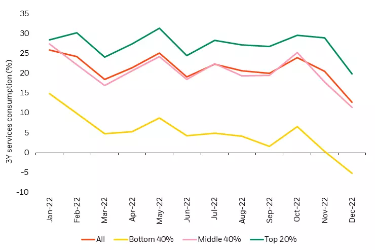
Source: BlackRock, Yodlee/ConsumerEdge, Earnest Research, as of December 2022.
Alternative data reveals an improving picture for inflation, orderly rebalancing of the labour market and a relatively healthy consumer – each currently more supportive of the case for a soft landing than a hard landing.
Market pricing has increasingly shifted towards the expectation for interest rate cuts by the end of 2023 (Figure 7). This can be supported by two opposing viewpoints: 1) the hard landing scenario which expects policymakers to overtighten and engineer a recession, or 2) a scenario where inflation swiftly returns to the 2% target and the Fed is able to begin easing financial conditions. In our view, both of these scenarios are unrealistic. Instead, we believe rates will remain higher for longer rather than a near term policy pivot. Today’s relatively stable economy may remain more resilient to high rates and policymakers are likely to delay easing financial conditions due to the lingering effects of two years of excessive inflation.
Figure 7: Market is currently pricing in rate cuts by the end of 2023
Market implied policy rates

Source: BlackRock, with data from Bloomberg, as of January 19, 2023.
Equity market positioning for Q1, 2023
After a challenging year for equity markets in 2022, the downward trajectory of inflation and continued economic stability point to a slightly more positive outlook in the coming months. How are these insights shaping our positioning across the global equity landscape?
An expanding global opportunity set
Like the US, the outlook for Europe has started to improve despite core inflation remaining at record highs. A warmer than expected winter has relieved some of the pressure from the energy crisis. Wage growth has also started to come down in Europe as labour markets normalise at an even faster pace than in the US. In China, the economic reopening has quickly taken off. Along with relaxed COVID-19 restrictions, there’s been an easing in common prosperity and antimonopoly regulations. This is an added tailwind to the improving sentiment towards Chinese assets, particularly in sectors like education, internet and real estate that were most impacted by these regulatory initiatives.
Sector positioning for a potential soft landing
Our global portfolios maintain a preference for value vs growth based on continued themes of high rates and inflation followed by a potential soft landing. Notably, we’ve seen a shift in the underlying sectors driving the top down leadership of value. What was previously led by the energy sector has shifted to favour cyclical sectors that have been heavily discounted over the last year, including capital goods, consumer durables, autos and airlines where we’re currently overweight. These are well positioned for a continued high interest rate environment where the economy ultimately avoids a deep recession.
Conclusion
As we enter the next phase in the fight against inflation, market focus has shifted to whether policymakers can achieve a durable decline in inflation without causing a recession. Using alternative data to cut through the noise of hard vs soft landing speculation, we see signs of progress in restoring price stability while maintaining economic strength. At the same time, macroeconomic uncertainty remains high and we expect market volatility to persist as conditions evolve. This makes a data centric investment approach crucial to navigating today’s complex environment, allowing us to remain nimble as investors during a time where dynamism matters most.
Source: BlackRock
Five long term global trends and implications for markets
By Robert Wright /March 07,2023/

This article looks at some longer term structural trends in the economy and their impact on economic growth and investments.
1. A decline in routine based jobs
Fear of technology replacing jobs has been around for years, although concern around this risk appears to have waned in recent times, as impacts of the pandemic on labour markets has taken focus. New technology is constantly displacing some jobs but it is also creating new ones in its place. The jobs most at risk are routine based jobs, because this type of work can be replicated, learned and taught by machinery and automatic intelligence. In Australia, there has been a long term decline in manual and cognitive routine based jobs. In the late 1980s, routine manual jobs were 40% of the workforce and are now around 26% of the workforce while routine cognitive jobs were 26% of the workforce in the late 1980s and are now worth 19% (see chart). Similar medium term trends are evident across other developed countries. Non routine jobs (either manual or cognitive) are less at risk of being displaced by technology because they are harder to replicate and often need a human element (for example in jobs related to health, childcare or teaching). Problems in recent years with self driving cars also shows the difficulties associated with technology.
Middle income households tend to be most susceptible to routine based jobs so this trend will increase inequality and could put downward pressure on wages growth in the long run. The OECD (Organisation for Economic Co-operation and Development) in a report done in 2018, estimated that around 14% of jobs (in the OECD) are at high risk from automation, with large variations across countries (countries at higher risk include Slovakia, Slovenia, Greece and Spain while the countries at the lowest risk include Norway, Australia, Finland and Sweden). The workforces that are more at risk tend to have a lower educated workforce, a weak tradeable services sector and have a low urbanisation rate. In Australia, around 7% of jobs are estimated to be at high risk of automation and in the US its slightly higher at 10%. The government has a role to play in ensuring that the transition to new types of employment for impacted employees is managed through training programs, appropriate university curriculum and ensuring that funding is targeting those areas at the highest risk of job losses due to automation.

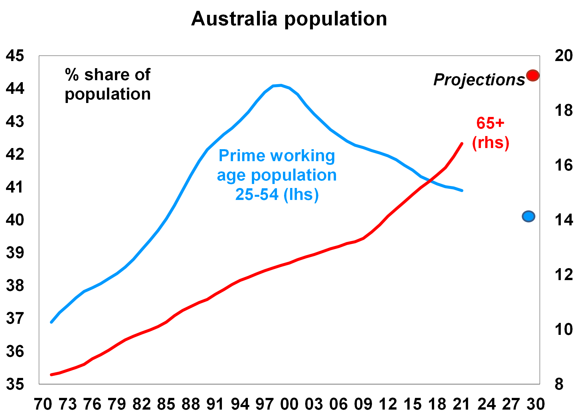
2. An ageing population and an increase in the ‘dependency ratio’
The global population, especially in major developed countries, is ageing which has been a long term trend as the birth rate has declined. In Australia, the share of the prime working age population (those aged between 25-54) peaked at 44% of the population in 1999 and has been falling slowly since then, currently at around 41% and projected to be around 40% by the end of the decade. In contrast, the share of the population that is aged 65+ is expected to keep climbing to just under 20% by 2030, up from 17% now (see chart). An ageing population will put upwards pressure on the ‘dependency ratio’ (the sum of those aged under 15 and over 65 as a share of the whole population) which will detract from national savings (people who work increase savings while the very young and old drain savings) which is inflationary in the long term.
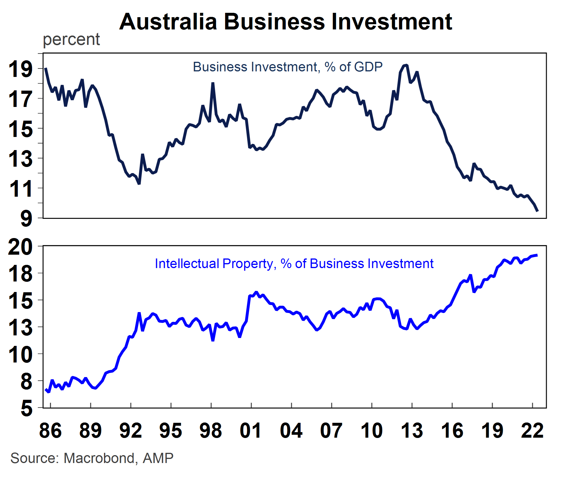
3. A decline in business investment as a share of GDP but a lift in intellectual property as a share of investment
In many developed countries, private business investment is declining as a share of the economy, in place of a rising services sector which is less investment intensive. In Australia, business investment often goes through cycles because of the dominance of the mining sector (at its peak mining investment reached 11% of GDP). After the last mining investment boom (which ended in 2012 after business investment was 19% of GDP), investment has been on a gradual decline and is now 9.4% of GDP (see chart). While there may be ups and downs in the cycle from the mining investment contribution and the usual wear and tear associated with depreciation, private business investment is likely to decline further as a share of GDP because of the changing nature of business investment. The typically large scale buildings and structures, machinery and equipment type of investment is being replaced with less ‘heavy’ types of investment, like intellectual property with the rising importance of the tech sector in all industries. A less capital intensive economy could weigh on long run productivity growth, although the impact is probably marginal as intellectual property investment should still boost productivity growth.
4. A multi polar world means more geopolitical risks
The US economy has been increasing in importance to the global economy since the end of the Second World War. The rising significance of the US economy to global trade, cultural influences, military presence and economic power has been increasingly consistent with a unipolar world, especially as the United Kingdom and the Eurozone have had challenging economic conditions in the past decade.
However, the balance of power has been shifting in recent years as the Chinese economy grows and becomes a larger share of the global economy (see chart). In purchasing power parity (PPP) terms (which adjusts individual country prices into a global comparison after accounting for exchange rates and purchasing power in each country which allows a better sense of living standard comparison) the Chinese economy is already the largest in the world (at 19% versus the US at 16%). If we also account for India then China and India make up 26% of the global economy compared to the US, UK and the Eurozone at 27% (in PPP terms). But we are currently at a crossroads, with China and India about to take over as a larger share of the global economy. On our estimates China and India will be 34% of the global economy by 2045, versus 22% for the US, UK and Eurozone (if growth rates continue at its current pace). As a result, the global economy is increasingly moving towards a multi-polar world as the balance of power shifts away from the US. This shift in the balance of power will keep geopolitical tensions and risks high over coming years as the US and China compete for global control, particularly in the technological space. Investors should be prepared for periodic inflammations in geopolitical tensions and heightened risks of conflict or war, keeping volatility in share markets high. Concerns over the growing Chinese economy are expected to again be a feature of both the Democratic and Republican party campaigns in the 2024 US Presidential election. However, in Australia, the relationship with China looks to be improving with a recent meeting between Australian PM Albanese and China’s President Xi Jinping seemingly the most positive in years.

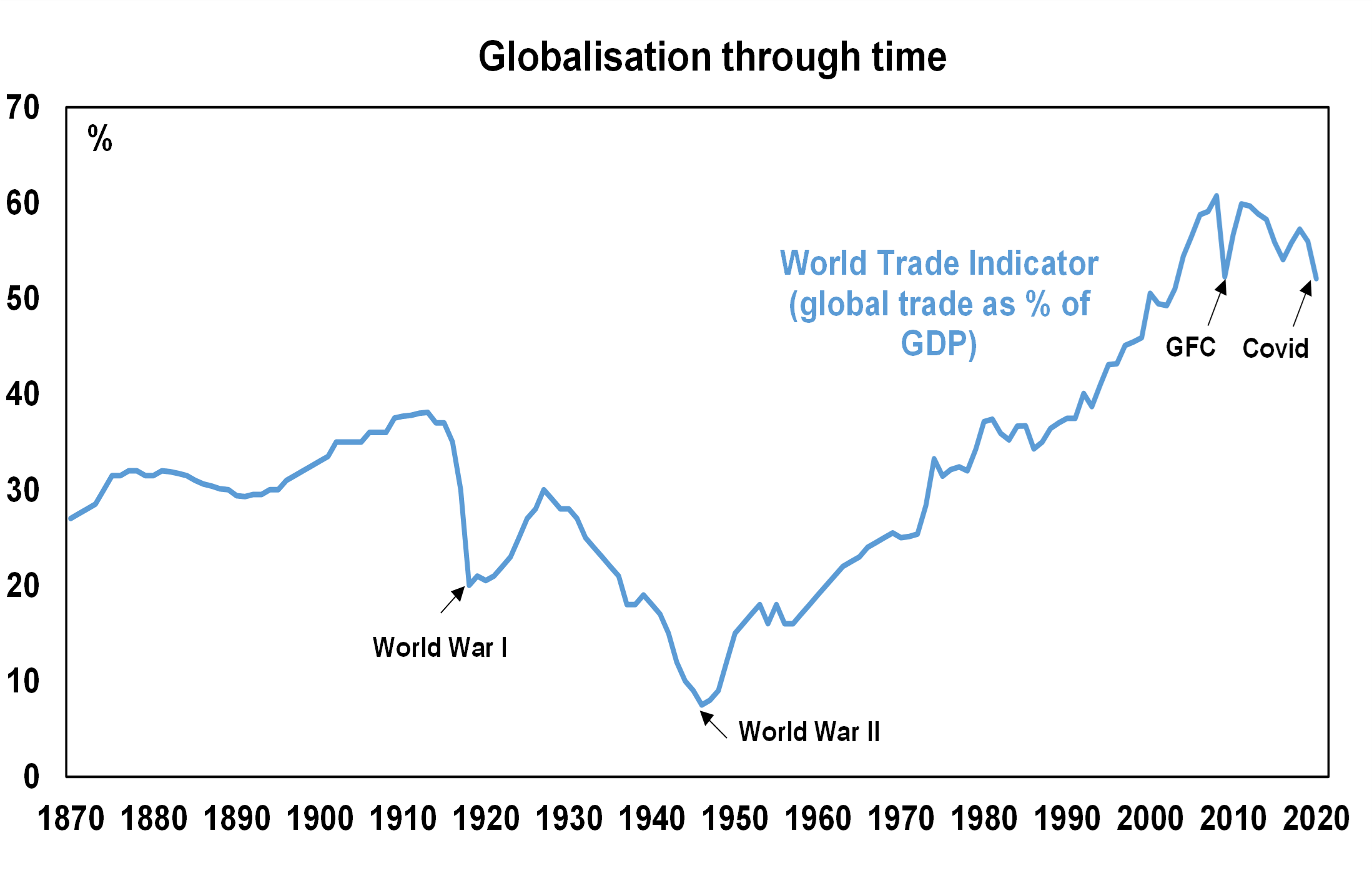
5. Peak globalisation is inflationary
Globalisation looked to be reaching a peak before COVID-19 broke out, with global trade (the sum of exports and imports) declining as a share of GDP since the Global Financial Crisis in 2008 (the chart shows that global trade was 56% of GDP in 2019, below its peak of ~61% before the GFC), as countries decided to become more self-sufficient after seeing the contagion impacts of the GFC. COVID-19 dealt another blow to global trade as closed borders and transport delays led to a push towards bringing as much production onshore as possible, or at least to closer countries (‘nearshoring’ or ‘friendshoring’). Given that globalisation was disinflationary because production was transferred to countries to the most efficient producer (which most often ended up being the lowest cost producer) some reversal in the globalisation trend will be more inflationary for the global economy.
Source: AMP
Why investing for retirement is different
By Robert Wright /March 07,2023/

When you’re still employed and earning a salary, there’s money coming in you can rely on. In retirement, in the absence of a regular salary you’ll need to find a new way to secure enough income to cover your living costs.
Investing your money is one way to make the most of your savings and provide an income in retirement but if you’re expecting savings and investment earnings to help cover your expenses, it’s important to get your strategy right.
Why timing matters
When accumulating super for retirement, you can afford to be patient. With years ahead to top up your super, you can stay invested during falls in the share market and wait for markets and your assets to bounce back. For the few years just before and after retirement, it’s a different story. This period, known as the ‘retirement risk zone’, is the time when you have most to lose from a fall in the value of investments. Your super has likely reached its peak in value and you want to make the most of these savings for your future retirement income.
In order to protect your savings and provide you with income throughout your retirement, it’s important to be aware of three key risks:
1. Living longer
Australians are living longer than ever before. Life expectancy has grown by more than 30 years in the last century1. Living off retirement savings for 20-30 years or more introduces the very real risk of running out of money. So it’s no wonder more than half of Australians aged 50+ are worried about outliving their savings according to a 2019 National Seniors Australia survey.
We’re lucky that we live in a country that if your retirement savings run out; the Age Pension is there as a safety net but these regular payments may not be enough to maintain the lifestyle you’ve been enjoying in retirement. You could also be left with limited funds and options for aged care, if you should need it. That’s why it’s so important to make a financial plan early in your retirement so that you can help to protect your income now and in the future.
2. Inflation
Inflation measures the change in the cost of living over time and represents an important and often underestimated risk to your financial security in retirement. Given your retirement could last 20 plus years, there’s a good chance your savings and income will be affected by inflation. At an average annual inflation rate of 2.5%2, a dollar today is worth roughly half what it was 25 years ago. Even this modest year on year rise in the price of goods and services can put you at risk of having an income that no longer covers your living expenses from year to year.
3. Share market performance
Share market performance is a risk for investors with exposure to investments such as shares, bonds and commodities. If you’re worried about market collapses similar to the Global Financial Crisis (GFC) in 2008, you’re not alone. A 2018 National Seniors Australia survey found that 7 out of 10 older Australians share your concerns.
Falls in the value of investments are impossible to predict and can make a big difference to income and financial security throughout your retirement. When investments earn negative returns, your retirement savings are falling in value. Crucially, if you also need to make regular withdrawals to pay for living expenses, it’s a twofold blow for your overall financial position in retirement. Less savings now means more potential for outliving those savings later in life.
Protecting your income and future in retirement
Diversifying your investments – balancing growth and defensive assets for example can limit the impact of market risks and inflation on your retirement savings. However, even with a well diversified portfolio, your super and Age Pension may not provide you enough income for your entire retirement. If you’d like the peace of mind that comes with a regular income for life, a lifetime annuity might be right for you.
Using a portion of your savings or super, you can invest in a lifetime annuity and receive regular income payments for life. It can act as a safety net ensuring that you will receive income for life, regardless of how long you live.
Talk to an adviser about the benefits of a lifetime annuity and whether it might be right for you.
[1] Australian Bureau of Statistics, Life Expectancy improvements in Australia over the last 125 years, 18 October 2017.
[2] Australian Bureau of Statistics, 70 years of inflation in Australia, Andrew Glasscock, 2017. Fig 2.
Source: Challenger