
Tag Archives: Shares
Seven key charts for investors to keep an eye on
By Robert Wright /December 01,2023/

Introduction
At the start of this year, we thought shares would have reasonable returns albeit it wouldn’t be smooth sailing given ongoing issues around inflation, interest rates, the risk of recession and geopolitics. So far so good. This note updates seven key charts we see as critical for the investment outlook.
Chart 1 – global business conditions PMIs
A big determinant of whether share markets can move higher or resume the bear market in US and global shares that started last year, will be whether major economies slide into recession and, if so, how deep that is. Our assessment is that the risk of a mild recession is high (particularly in Australia), but that at least a deep recession should be avoided. Global business conditions indexes (PMIs) – which are surveys of purchasing managers at businesses – will be a key warning indicator.
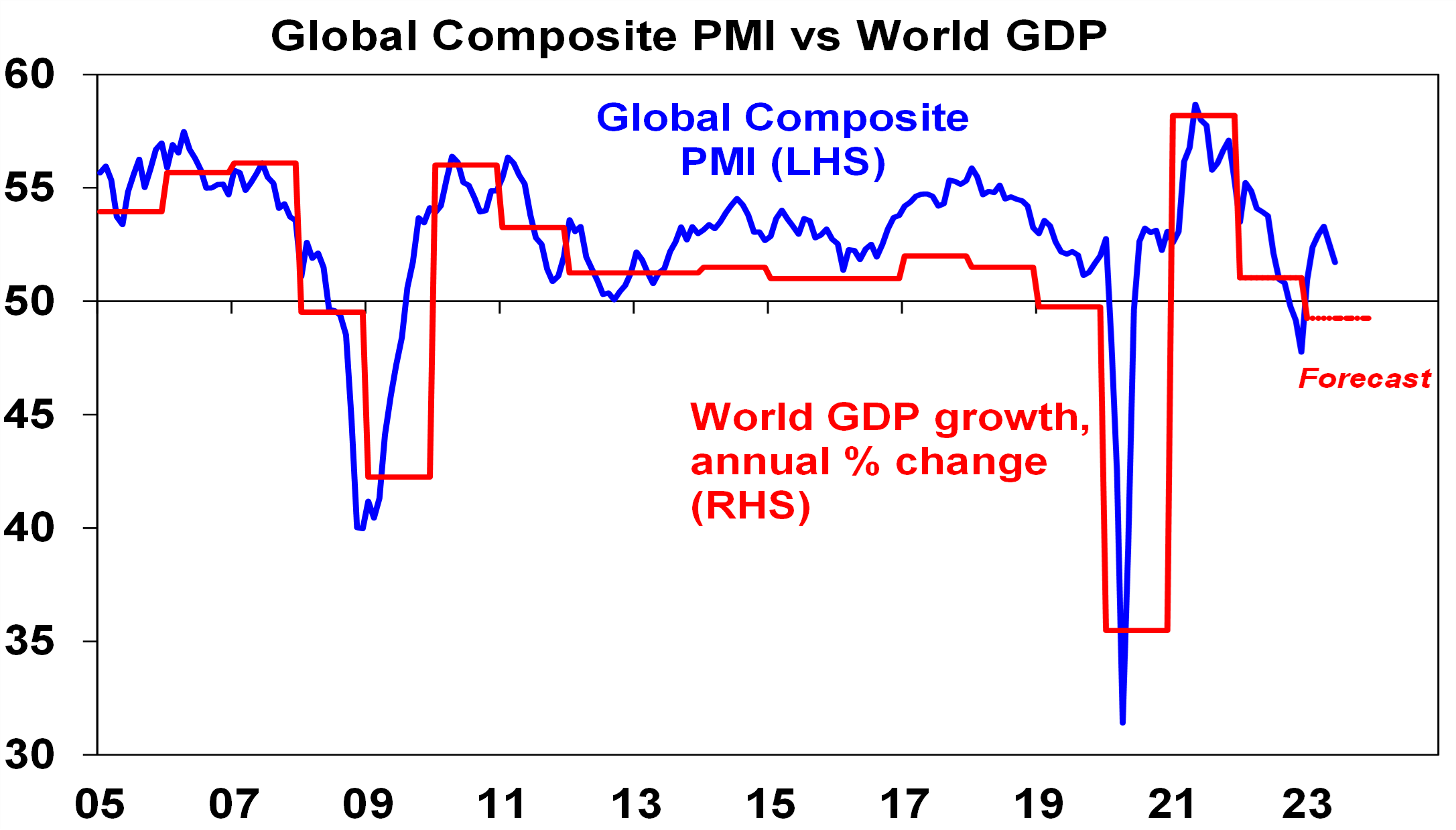
Source: Bloomberg, AMP
So far, they have proven resilient. While slowing again after a bounce – partly due to China – they are at levels consistent with okay global growth.
Chart 2 (and 2b) – inflation
Of course, a lot continues to ride on how far key central banks raise interest rates. And as has been the case for the last 18 months or so the path of inflation will play a key role in this. Over the last six months the news on this front has continued to improve with inflation rates in key countries rolling over. US inflation has now fallen from 9.1% YOY a year ago to 3% in June and our US Pipeline Inflation Indicator – reflecting a mix of supply and demand indicators – continues to point to a further decline. This reflects a combination of lower commodity prices, improved supply, lower transport costs and easing demand. Just as goods price inflation led on the way up, it’s now leading on the way down with services inflation rolling over as well.

Source: Bloomberg, AMP
Australian inflation is lagging the US by 6 months, but our Australian Pipeline Inflation Indicator suggests inflation here will continue to fall, even though we did see a rise in the September quarter of 1.2 per cent due to the uncertainty brought on by the Israel and Palestine conflict. The RBA has maintained its position in holding rates higher for longer to stop inflation. Our assessment is that the RBA is close to the top with rate cuts starting in February next year.
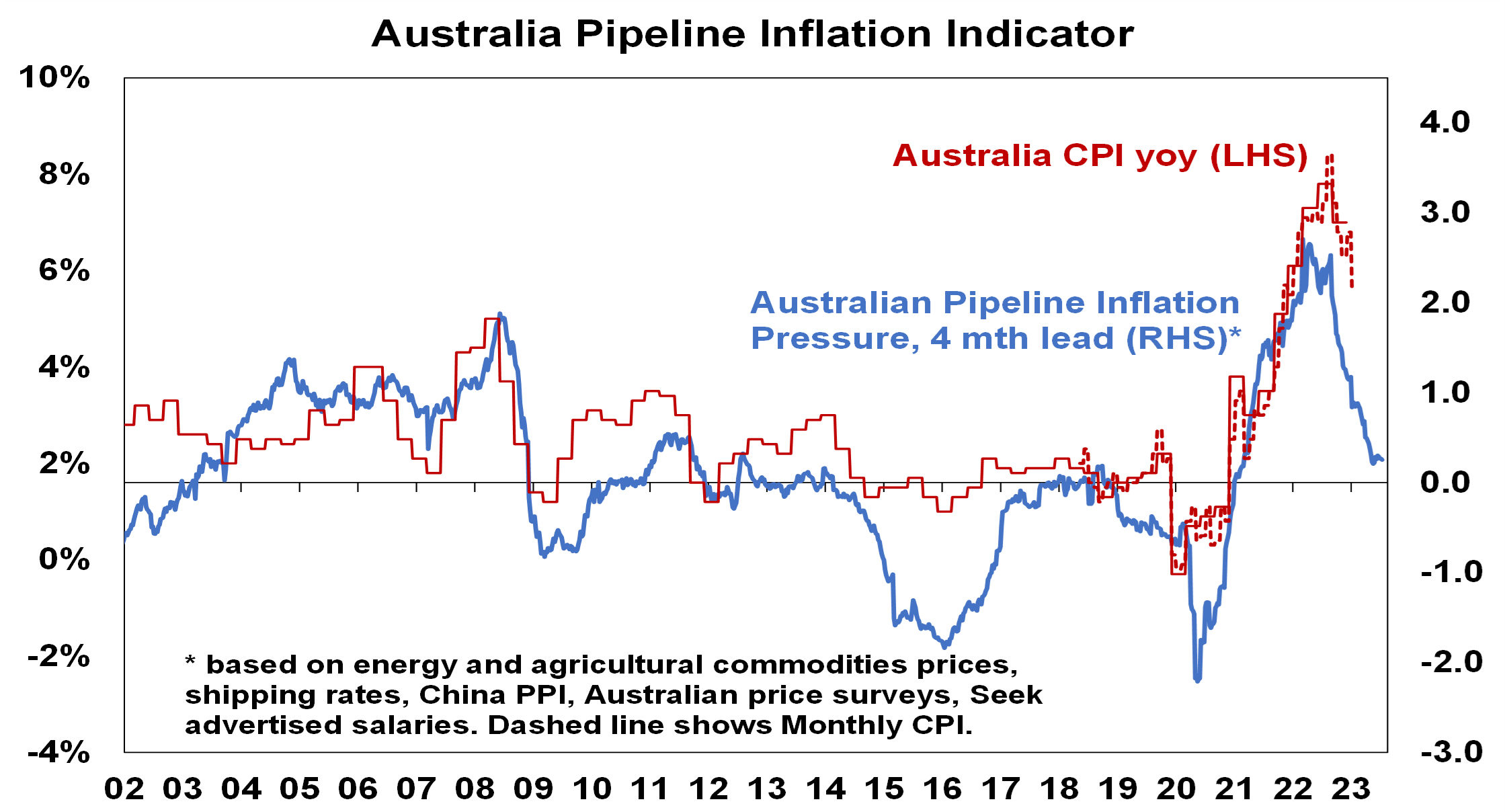
Source: Bloomberg, AMP
Chart 3 – unemployment and underemployment
Also critical is the tightness of labour markets as this will determine wages growth which has a big impact on services inflation. If wages growth accelerates too much in response to high inflation, it risks locking in high inflation with a wage-price spiral which would make it harder to get inflation down. Unemployment and underemployment are key indicators of whether this will occur or not. Both remain low in the US and Australia (putting upwards pressure on wages), but there is increasing evidence that labour markets are cooling. Wages growth is still rising in Australia (with the announcement effect of faster increases in minimum and award wages adding to this) but wages growth in the US looks to have peaked.
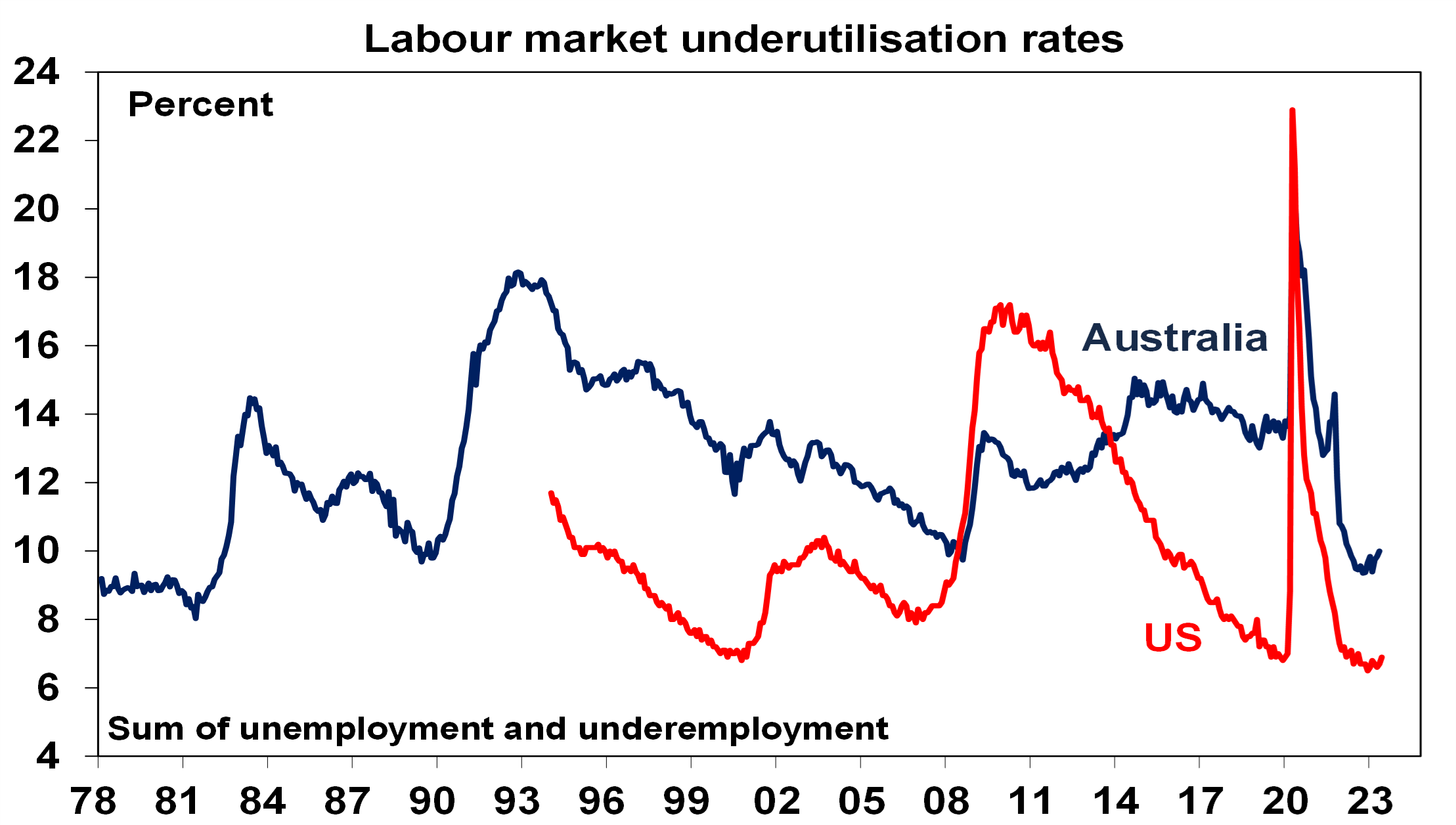
Source: Bloomberg, AMP
Chart 4 – longer term inflation expectations
The 1970s experience tells us the longer inflation stays high, the more businesses, workers and consumers expect it to stay high and then they behave in ways which perpetuate it – in terms of wage claims, price setting and tolerance for price rises. The good news is that short term (1-3 years ahead) inflation expectations have fallen sharply and longer term inflation expectations remain in the low range they have been in for the last three decades. This is very different from 1980 when inflation expectations were around 10% and deep recession was required to get inflation back down.
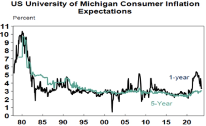
Source: Macrobond, AMP
Chart 5 – earnings revisions
Consensus US and global earnings growth expectations for this year have been downgraded to around zero with a 10% rise next year and for Australia the consensus expects a 3% fall this financial year.

Source: Reuters, AMP
A recession resulting in an earnings slump like those seen in the early 1990s, 2001-03 in the US and 2008 would be the biggest risk but recently revisions to earnings expectations have been moving up.
Chart 6 – the gap between earnings and bond yields
Since 2020, rising bond yields have weighed on share market valuations. As a result, the gap between earnings yields and bond yields (which is a proxy for shares’ risk premium) has narrowed to its lowest since the GFC in the US and Australia. Compared to the pre-GFC period shares still look cheap relative to bonds, but this is not the case compared to the post GFC period suggesting valuations may be a bit of a constraint to share market gains as current uncertainties suggests investors may demand a risk premium over bonds similar to that seen post GFC as opposed to what was seen pre GFC. Australian share valuations look a bit more attractive than those in the US though helped by a higher earnings yield (or lower PEs). Ideally bond yields need to decline and earnings downgrades need to be limited.

Source: Reuters, AMP
Chart 7 – the US dollar
Due to the relatively low exposure of the US economy to cyclical sectors (like manufacturing), the $US tends to be a “risk-off” currency. In other words, it goes up when there are worries about global growth and down when the outlook brightens. An increasing $US is also bad news for those with $US denominated debt in the emerging world. So, moves in it bear close watching as a key bellwether of the investment cycle. Last year the $US surged with safe haven demand in the face of worries about recession, war and aggressive Fed tightening. Since September though it has fallen back as inflation and Fed rate hike fears eased and geopolitical risks receded. And after stalling over the last six months, it’s since broken down again. A further downtrend in the $US would be a positive sign for investment markets this year, whereas a sustained new upswing would suggest they may be vulnerable. So far it’s going in the right direction.
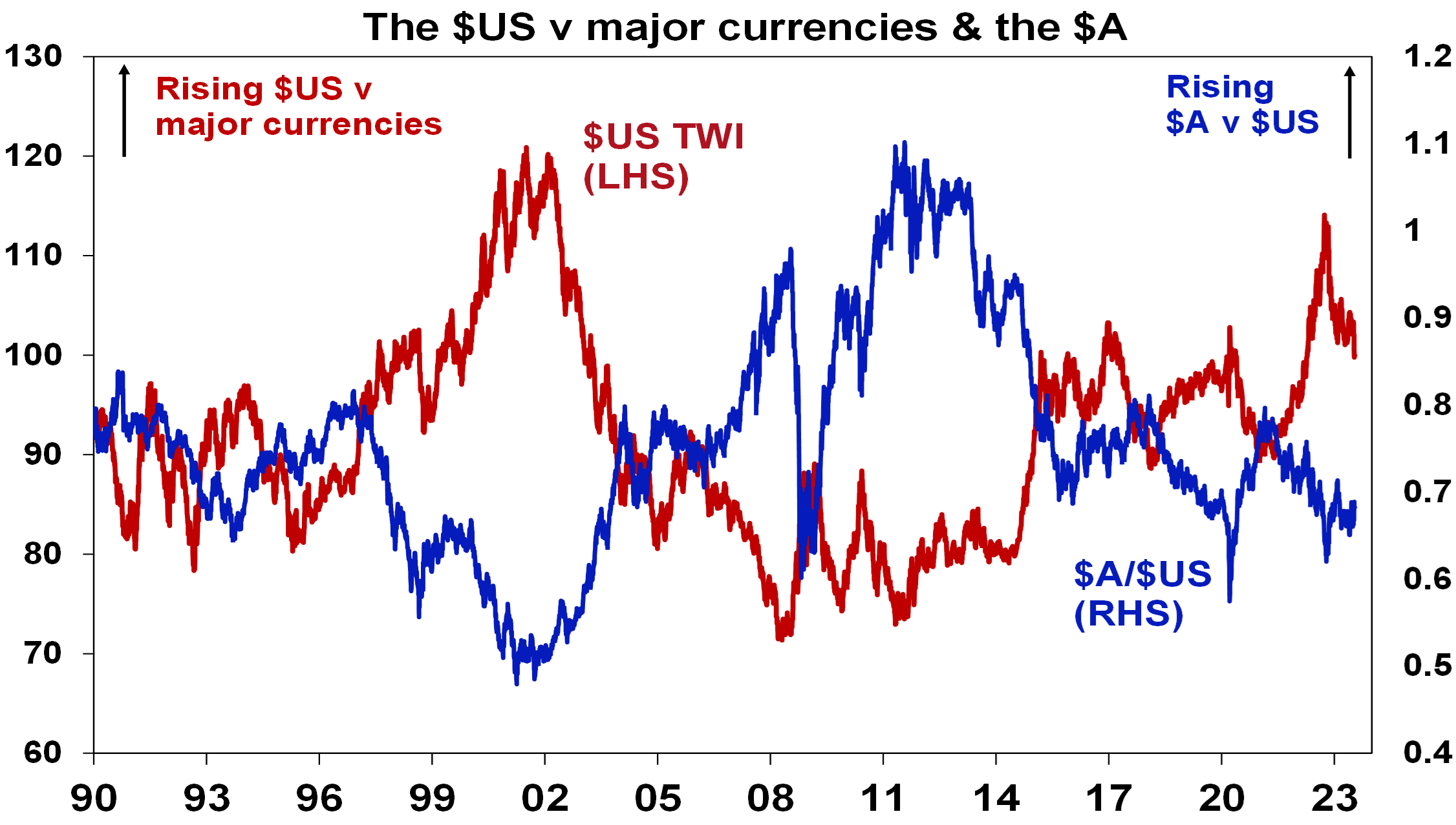
Source: Bloomberg, AMP
Source: AMP
Three reasons to err on the side of optimism as an investor
By Robert Wright /December 01,2023/

Introduction
The “news” as presented to us has always had a negative bend, but one could be forgiven for thinking that it’s become even more negative with constant stories of disasters, conflict, wrongdoing, grievance and loss. Consistent with this it seems that the worry list for investors is more threatening and confusing. This was an issue prior to coronavirus – with trade wars, social polarisation, tensions with China, worries about job loss from automation and ever-present predictions of a new financial crisis. Since the pandemic higher public debt, inflation, geopolitical tensions and rising alarm about climate change have added to the worries. These risks can’t be ignored but it’s very easy to slip into a pessimistic perspective regarding the outlook. However, when it comes to investing the historical track record shows that succumbing too much to pessimism doesn’t pay.
Three reasons why worries might seem more worrying
Some might argue that since the GFC the world has become a more negative place and so gloominess or pessimism is justifiable. But given the events of the last century – ranging from far more deadly pandemics, the Great Depression, several major wars and revolutions, numerous recessions with high unemployment and financial panics – it’s doubtful that this is really the case viewed in the long term sweep of history.
There is no denying there are things to worry about at present – notably inflation, political polarisation, less rational policy making and geopolitical tensions – and that these may result in more constrained investment returns. But there is a psychological aspect to this combining with greater access to information and the rise of social media to magnify perceptions around worries. All of which may be adding to a sense of pessimism.
Firstly, our brains are wired in a way that makes us natural receptors of bad news. Humans tend to suffer from a behavioural trait known as “loss aversion” in that a loss in financial wealth is felt much more negatively than the positive impact of the same sized gain. This probably reflects the evolution of the human brain in the Pleistocene age when the key was to avoid being eaten by a sabre-toothed tiger or squashed by a woolly mammoth. This left the human brain hard wired to be on guard against threats and naturally risk averse. So, we are more predisposed to bad news stories as opposed to good. Consequently, bad news and doom and gloom find a more ready market than good news or balanced commentary as it appeals to our instinct to look for risks. Hence the old saying “bad news and pessimism sells”. This is particularly true as bad news shows up as more dramatic whereas good news tends to be incremental. Reports of a plane (or a share market) crash will be far more newsworthy (generating more clicks) than reports of less plane crashes this decade (or a gradual rise in the share market) ever will. As a result, prognosticators of gloom are more likely to be revered as deep thinkers than optimists. As English philosopher and economist John Stuart Mill noted “I have observed that not the man who hopes when others despair, but the man who despairs when others hope, is admired by a large class of persons as a sage.”
Secondly, we are now exposed to more information on everything, including our investments. We can now check facts, analyse things, sound informed easier than ever. But for the most part we have no way of weighing such information and no time to do so. So, it’s often noise. As Frank Zappa noted “Information is not knowledge, knowledge is not wisdom”. This comes with a cost for investors. If we don’t have a process to filter it and focus on what matters, we can suffer from information overload. This can be bad for investors as when faced with more (and often bad) news, we can freeze up and make the wrong decisions with our investments. Our natural “loss aversion” can combine with what is called the “recency bias” – that sees people give more weight to recent events in assessing the future – to see investors project recent bad news into the future and so sell after a fall. As famed investor Peter Lynch observed “Stock market news has gone from hard to find (in the 1970s and early 1980s), then easy to find (in the late 1980s), then hard to get away from”.
Thirdly, there has been an explosion in media competing for attention. We are now bombarded with economic and financial news and opinions with 24/7 coverage by multiple web sites, subscription services, finance updates, dedicated TV and online channels, chat rooms and social media. This has been magnified as everything is now measured with clicks – stories (and reporters) that generate less clicks don’t get a good look in. To get our attention, news needs to be entertaining and, following from our aversion to loss, in competing for our attention, dramatic bad news trumps incremental good news and balanced commentary. So naturally it seems the bad news is “badder” and the worries more worrying than ever which adds to a sense of gloom. The political environment has added to this with politicians more polarised and more willing to scare voters.
Google the words “the coming financial crisis” and it’s teeming with references – 270 million search results at present – and as you might expect many of the titles are alarming:
“A recession worse than 2008? How to survive and thrive”.
“Could working from home cause the next financial crisis?”
“Economic crash is inevitable”.
“Three men predicted the last financial crisis – what they’re warning of now is terrifying”.
“How China’s debt problem could trigger a financial crisis”.
People have always been making gloomy predictions of “inevitable” and “imminent” economic and/or financial disaster but prior to the information explosion and social media it was much harder to be regularly exposed to such disaster stories. The danger is that the combination of the ramp up in information and opinion, combined with our natural inclination to zoom in on negative news, is making us worse investors: more distracted, pessimistic, jittery and focused on the short term.
Three reasons to be optimistic as an investor
There are three good reasons to err on the side of optimism as an investor.
Firstly, without a degree of optimism there is not much point in investing. As the famed value investor, Benjamin Graham pointed out: “To be an investor you must be a believer in a better tomorrow”. If you don’t believe the bank will look after your deposits, that most borrowers will pay back their debts, that most companies will see rising profits over time supporting a return to investors, that properties will earn rents, etc. then there is no point investing. To be a successful investor you need to have a reasonably favourable view about the future.
Secondly, the history of share markets (and other growth assets like property) in developed, well managed countries, with a firm commitment to the rule of law, has been one of the triumph of optimists. Sure, share markets go through bear markets and often lengthy periods of weakness – where pessimists get their time in the sun – but the long term trend has been up, underpinned by the desire of humans to find better ways of doing things resulting in a real growth in living standards. This is indicated in the next chart which tracks the value of $1 invested in Australian shares, bonds and cash since 1900 with dividends and interest reinvested along the way. Cash is safe and so fine if you are pessimistic but has low returns, and that $1 will have only grown to $250 today. Bonds are better, and that $1 will have grown to $903. Shares are volatile (and so have rough periods – see the arrows) but if you can look through that, they will grow your wealth and that $1 will have grown to $811,079.

Source: ASX, Bloomberg, RBA, AMP
This does not mean blind optimism where you get sucked in with the crowd when it becomes euphoric or into every new whiz bang investment obsession that comes along (like bitcoin or the dot com stocks of the 1990s). If an investment looks too good to be true and the crowd is piling in, then it probably is – particularly if the main reason you are buying in is because of huge recent gains. So, the key is cautious, not blind, optimism.
Finally, even when it might pay to be pessimistic and hence out of the market in corrections and bear markets, trying to get the timing right can be very hard. In hindsight many downswings in markets like the GFC look inevitable and hence forecastable, and so it’s natural to think you can anticipate downswings going forward. But trying to time the market – in terms of both getting out ahead of the fall and back in for the recovery – is difficult. A good way to demonstrate this is with a comparison of returns if an investor is fully invested in shares versus missing out on the best (or worst) days. The next chart shows that if you were fully invested in Australian shares from January 1995, you would have returned 9.3% pa (with dividends but not allowing for franking credits, tax and fees).

Covers Jan 1995 to March 2023. Source: Bloomberg, AMP
If you were pessimistic about the outlook and managed to avoid the 10 worst days (yellow bars), you would have boosted your return to 12.2% pa. And if you avoided the 40 worst days, it would have been boosted to 17.1% pa! But this is very hard, and many investors only get really pessimistic and get out after the bad returns have occurred, just in time to miss some of the best days. For example, if by trying to time the market you miss the 10 best days (blue bars), the return falls to 7.2% pa. If you miss the 40 best days, it drops to just 3% pa.
As Peter Lynch has pointed out “More money has been lost trying to anticipate and protect from corrections than actually in them”.
On a day to day basis it’s around 50/50 as to whether shares will be up or down, but since 1900, shares in the US have had positive returns around seven years out of ten and in Australia it’s around eight years out of ten.

Daily and monthly data from 1995, data for years and decades from 1900. Source: ASX, Bloomberg, AMP
So, getting too hung up in pessimism on the next crisis that will, on the basis of history, drive the market down in two or three years out of ten may mean that you end up missing out on the seven or eight years out of ten when the share market rises. Here’s one final quote to end on.
“No pessimist ever discovered the secrets of the stars, or sailed to an uncharted land, or opened a new heaven to the human spirit”.
– Helen Keller
Source: AMP
Five charts on investing to keep in mind in rough times
By Robert Wright /May 19,2023/

Key points
- Successful investing can be really difficult in times like now with immense uncertainty around inflation, interest rates, issues in global banks and recession risks impacting the outlook for investment markets.
- This makes it all the more important to stay focused on the basic principles of successful investing.
- These five charts focus on critical aspects of investing that are insightful in times of market stress: the power of compound interest; don’t get blown off by cyclical swings; the roller coaster of investor emotion; the wall of worry; and market timing is hard.
Introduction
Every so often the degree of uncertainty around investment markets surges and that’s been the case for more than a year now reflecting the combination of high inflation, rapid interest rate hikes, the high and rising risk of recession which has been added to in the last few weeks by problems in US and European banks. And all of this has been against the background of increased geopolitical uncertainties. Falls in the value of share markets and other investments can be stressful as no one wants to see their wealth decline. And so when uncertainty is high a natural inclination is to retreat to perceived safety. As always, turmoil around investment markets is being met with much prognostication, some of which is enlightening but much is just noise. I will be the first to admit that my crystal ball is even hazier than normal in times like the present. As the US Economist, JK Galbraith once said “there are two types of economists – those that don’t know and those that don’t know they don’t know.” And this is certainly an environment where we need to be humble.
But while history does not repeat as each cycle is different, it does rhyme, in that each cycle has many common characteristics. So, while each cycle is different the basic principles of investing still apply. This note revisits once again five charts I find particularly useful in times of economic and investment market stress.
Chart #1 The power of compound interest
This is my favourite chart. It shows the value of $1 invested in various Australian assets in 1900 allowing for the reinvestment of dividends and interest along the way. That $1 would have grown to $246 if invested in cash, to $997 if invested in bonds and to $781,048 if invested in shares up until the end of February. While the average return since 1900 is only double that in shares relative to bonds, the huge difference between the two at the end owes to the impact of compounding or earning returns on top of returns. So, any interest or return earned in one period is added to the original investment so that it all earns a return in the next period, and so on. I only have Australian residential property data back to 1926 but out of interest it shows (on average) similar long term compounded returns to shares.

Key message: to grow our wealth, we must have exposure to growth assets like shares and property. While shares and property have had a rough ride over the last year as interest rates surged, history shows that both will likely do well over the long term.
Chart #2 Don’t get blown off by cyclical swings
The trouble is that shares can have lots of (often severe) setbacks along the way as is evident during the periods highlighted by the arrows on the previous chart. Even annual returns in the share market are highly volatile but longer term returns tend to be solid and relatively smooth, as can be seen in the next chart. Since 1900, for Australian shares roughly two years out of ten have had negative returns but there are no negative returns over rolling 20-year periods.

The higher returns that shares produce over time relative to cash and bonds is compensation for the periodic setbacks they have. But understanding that these periodic setbacks are just an inevitable part of investing is important in being able to stay the course and get the benefit of the higher long term returns shares and other growth assets provide over time.
Key message: short term, sometimes violent swings in share markets are a fact of life but the longer the time horizon, the greater the chance your investments will meet their goals. So, in investing, time is on your side and it’s best to invest for the long term when you can.
Chart #3 The roller coaster of investor emotion
It’s well known that the swings in investment markets are more than can be justified by moves in investment fundamentals alone – like profits, dividends, rents and interest rates. This is because investor emotion plays a huge part. This has been more than evident over the last year with all the swings in markets. The next chart shows the roller coaster that investor emotion traces through the course of an investment cycle. Once a cycle turns down in a bear market, euphoria gives way to anxiety, denial, capitulation and ultimately depression at which point the asset class is under loved and undervalued and everyone who is going to sell has – and it becomes vulnerable to good (or less bad) news. This is the point of maximum opportunity. Once the cycle turns up again, depression gives way to hope and optimism before eventually seeing euphoria again.

Key message: investor emotion plays a huge role in magnifying the swings in investment markets. The key for investors is not to get sucked into this emotional roller coaster. Of course, doing this is easier said than done, which is why many investors end up getting wrong footed by the investment cycle.
Chart #4 The wall of worry
There is always something for investors to worry about it seems. And in a world where social media is competing intensely with old media it all seems more magnified and worrying. This is arguably evident again now in relation to uncertainty about inflation, interest rates and associated recessions risks. The global economy has had plenty of worries over the last century, but it got over them with Australian shares returning 11.7% per annum since 1900, with a broad rising trend in the All Ords price index as can be seen in the next chart, and US shares returning 9.9% pa. (Note that this chart shows the All Ords share price index whereas the first chart shows the value of $1 invested in the All Ords accumulation index, which allows for changes in share prices and dividends.)
Key message: worries are normal around the economy and investments and sometimes they become intense – like now but they eventually pass.

Chart #5 Timing is hard
The temptation to time markets is immense. With the benefit of hindsight many swings in markets like the tech boom and bust and the GFC look inevitable and hence forecastable and so it’s natural to think why not switch between say cash and shares within your super fund to anticipate market moves. This is particularly the case in times of emotional stress like now when much of the news around inflation, interest rates and recession risks seem bad. Fair enough if you have a process and put the effort in. But without a tried and tested market timing process, trying to time the market is difficult. A good way to demonstrate this is with a comparison of returns if an investor is fully invested in shares versus missing out on the best (or worst) days. The next chart shows that if you were fully invested in Australian shares from January 1995, you would have returned 9.3% pa (with dividends but not allowing for franking credits, tax and fees).

If by trying to time the market you avoided the 10 worst days (yellow bars), you would have boosted your return to 12.2% pa. And if you avoided the 40 worst days, it would have been boosted to 17.1% pa! But this is very hard, and many investors only get out after the bad returns have occurred, just in time to miss some of the best days. For example, if by trying to time the market you miss the 10 best days (blue bars), the return falls to 7.2% pa. If you miss the 40 best days, it drops to just 3% pa.
Key message: trying to time the share market is not easy. For most its best to stick to an appropriate well thought out long term investment strategy.
Source: Shane Oliver, AMP
Investment fundamentals to consider in volatile times
By Robert Wright /September 08,2022/

Sharp share market falls are stressful for investors as no one likes to see their investments fall in value. But at times like these, there are number of key things for investors to bear in mind.
Compounding
Compound interest is magical! The value of $1 invested in 1900, allowing for the reinvestment of dividends and interest along the way, by the end of May this year would have been worth $243 if invested in cash, $901 if invested in bonds, and $757,136 if invested in shares. Of course, this is pre-tax and fees but the relativities remain the same. The higher end point for shares reflects their higher long term return. So, to grow our wealth we need to have a long term exposure to growth assets like shares.
It’s cyclical
Sharp falls in share markets as we are now seeing are not nice, but they are a regular occurrence and the price we pay for the higher returns they provide over the longer term compared to assets like cash and bonds. The key is to recognise that these setbacks are part of the cycle. So, the key is to not get thrown off by the higher returns that shares and other growth assets provide over the longer-term by cyclical falls.
Diversify
The best performing asset class each year can vary dramatically. Last year’s top performer is no guide to the year ahead. So it’s important to have a combination of asset classes in your portfolio. This particularly applies to assets that have low correlation, i.e. that don’t just move in lock step with each other. A well-diversified portfolio is less volatile.
Understand risk and return
Put simply: the higher the risk of an asset, the higher the return you should expect to achieve over the long-term, and vice versa. There is no free lunch, and you should always allow for the risk and return characteristics of each asset in which you invest. If you don’t mind short-term risk, you can take advantage of the higher returns growth assets offer over long periods.
Time-in, not timing
In times of uncertainty like the present it’s tempting to try to time the market. But without a proven asset allocation or stock picking process, it’s next to impossible. Market timing is great if you can get it right, but without a process, the risk of getting it wrong is very high and can destroy your longer-term returns. Selling after big share market falls can feel comfortable given all the noise is negative but it locks in a loss and makes it much harder to recover.
Time is on your side
Since 1900 there are no negative returns over rolling 20-year periods for Australian shares. Short-term share returns can sometimes see violent swings, but the longer the time horizon, the greater the chance your investments will meet their goals. When it comes to investing, time is on your side, so invest for the long-term.
Remove the emotion
Emotion plays a huge roll in amplifying the investment cycle, both up and down. Avoid assets where the crowd is euphoric and convinced it’s a sure thing. Favour assets where the crowd is depressed, and the asset is under-loved. Don’t get sucked into the emotional roller coaster.
The wall of worry
It seems there’s plenty for investors to worry about at the moment. While this is real and creates uncertainty, in a long-term context it’s mostly noise. The global and Australian economies have had plenty of worries over the past century, but they got over them. Australian shares have returned 11.8 per cent per annum since 1900.
So, it’s best to turn down the noise around the short-term movements in investment markets.
Source: AMP